Finch Cambridge
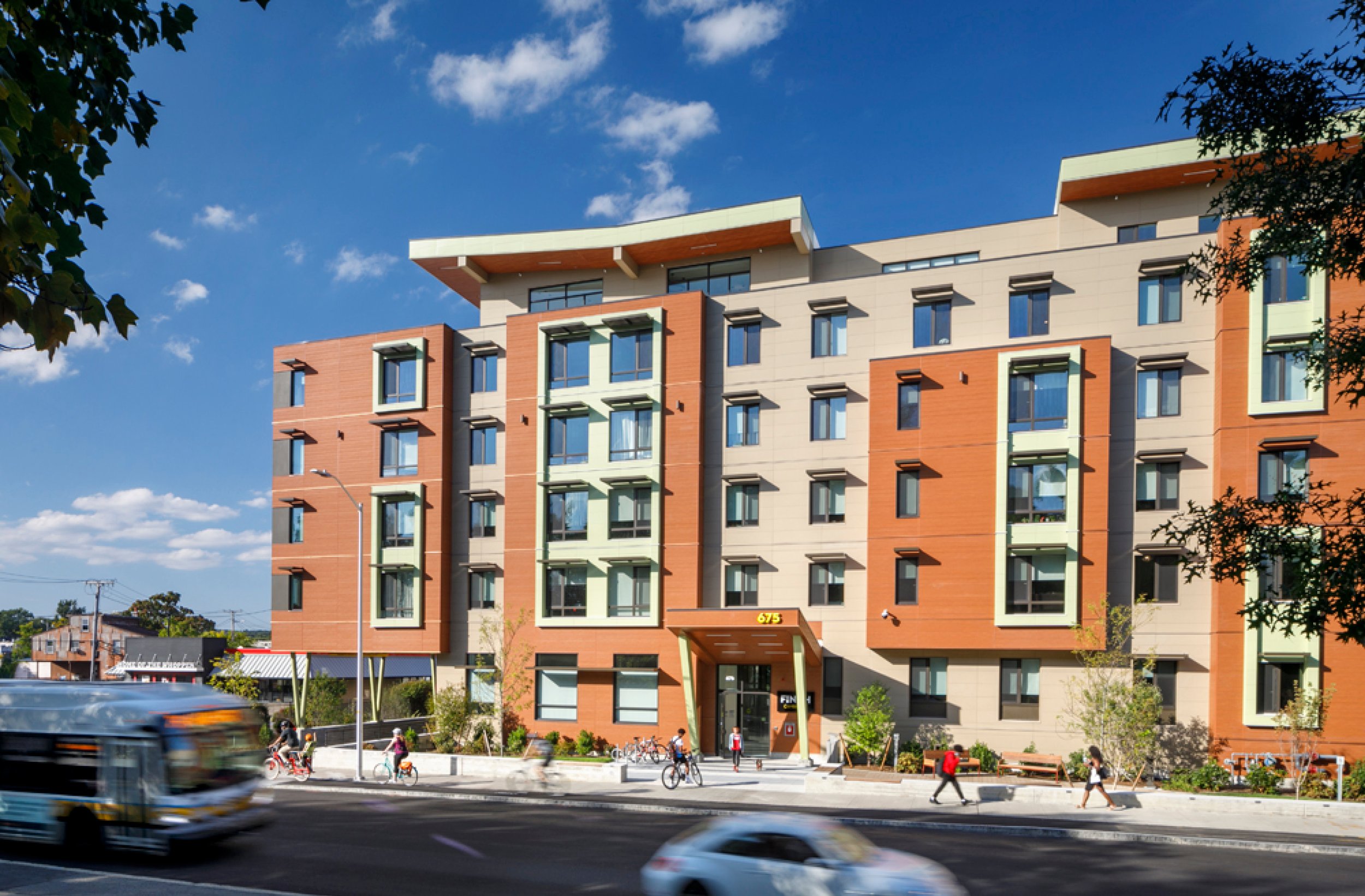
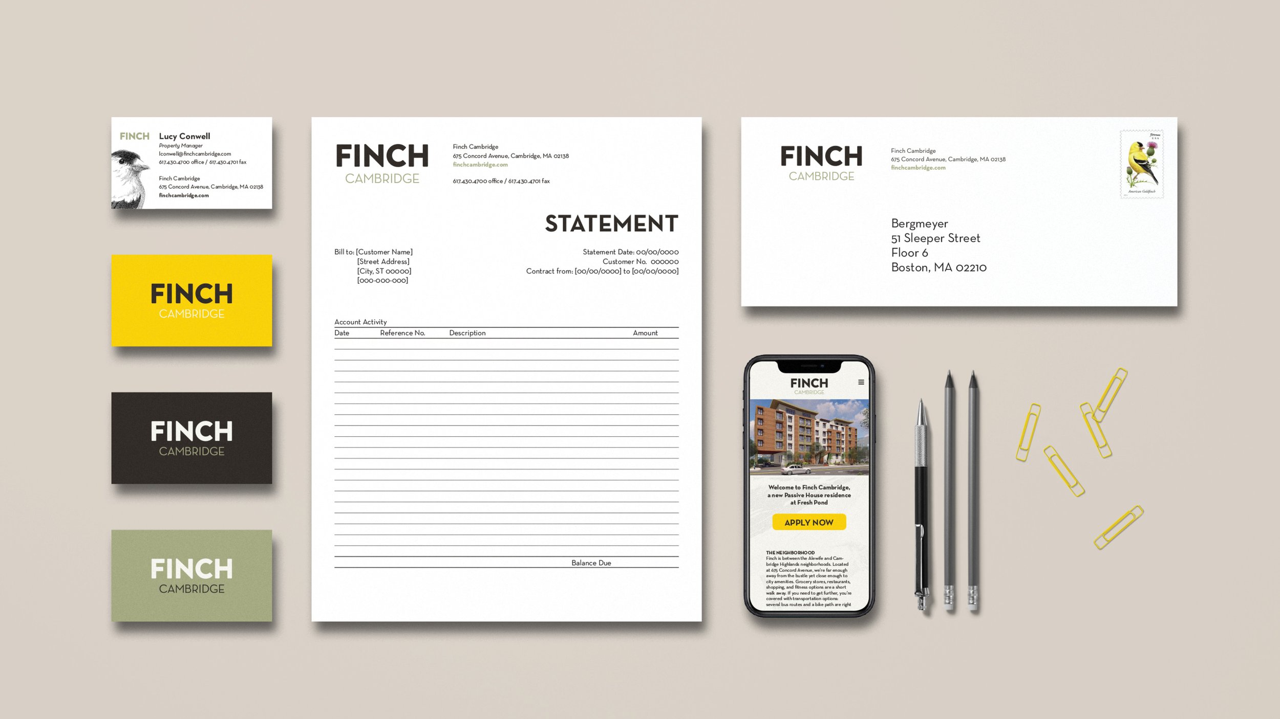
HRI’s mission is to support the development of mixed income communities, rich in diversity, and accessible to a wider range of residents. Our goal for this community included appealing to a broad, family-oriented demographic, responding to the environment, and creating an active place. The combination of their mission and the context of the neighborhood led to the new name and brand for Finch Cambridge.
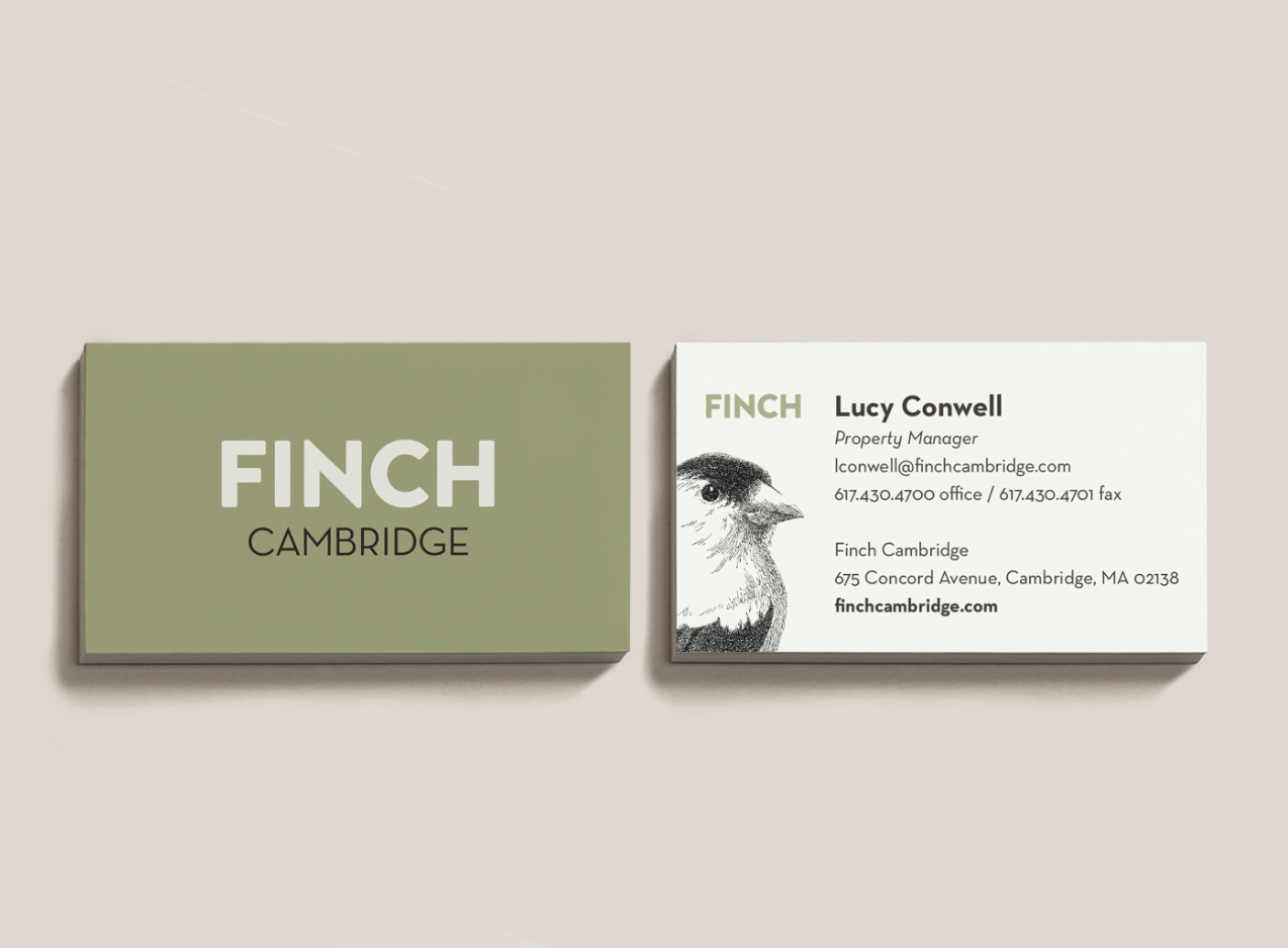
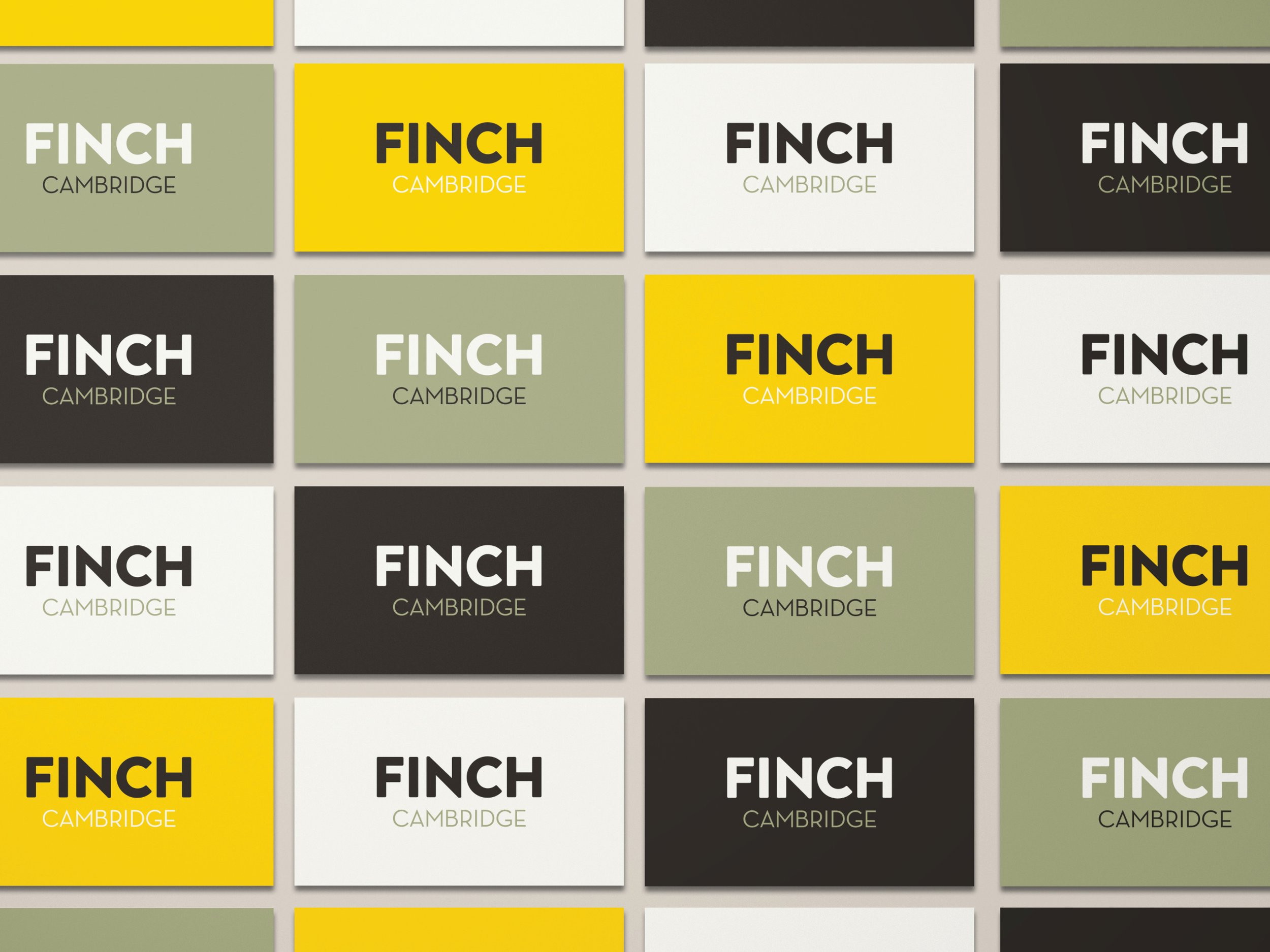
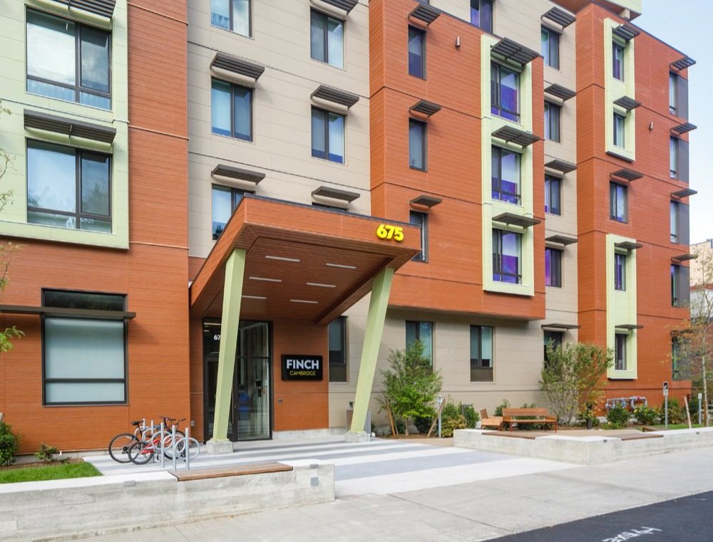
The brand establishes a strong connection to the adjacent Fresh Pond, the architecture, the city, and the environment. The palette picks up on the natural tones of the reservation, punctuated by a bold yellow inspired by the American Goldfinch, frequently spotted at Fresh Pond. Even the building takes inspiration from flight, with its playful roof line like spread wings.
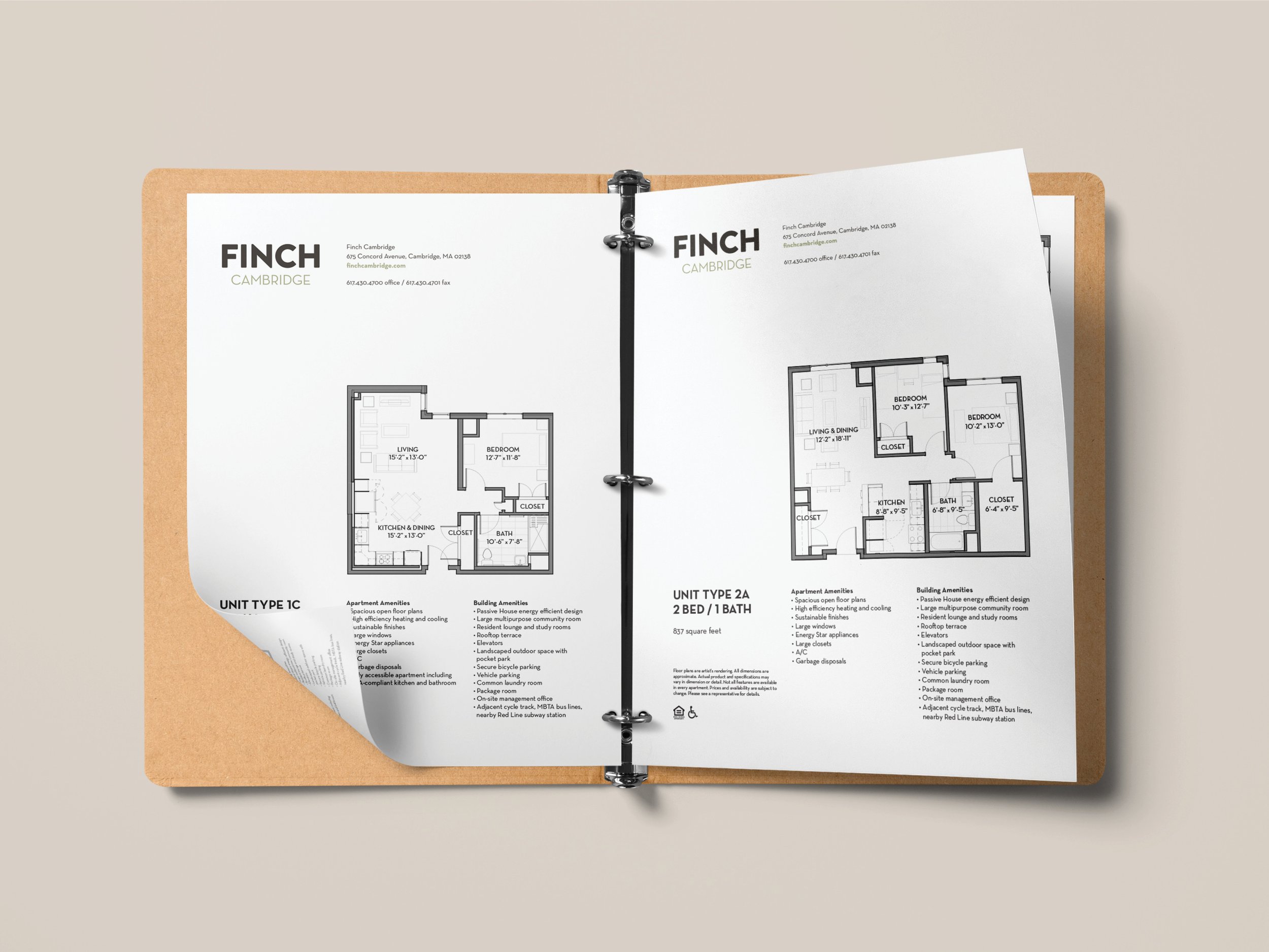
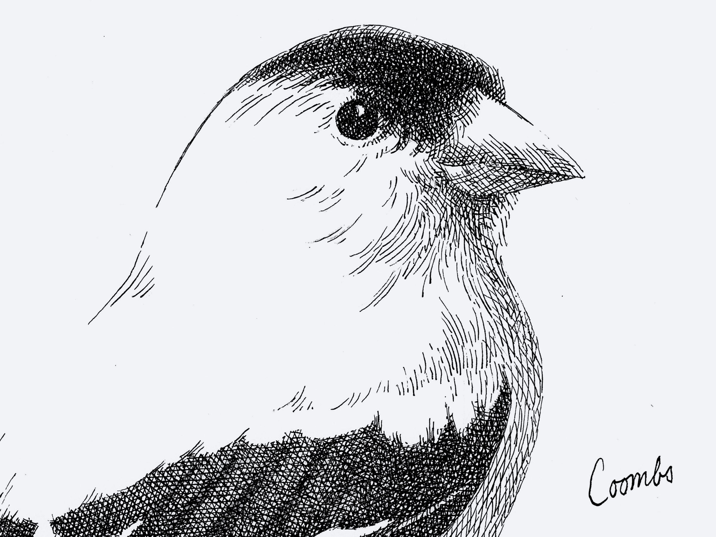
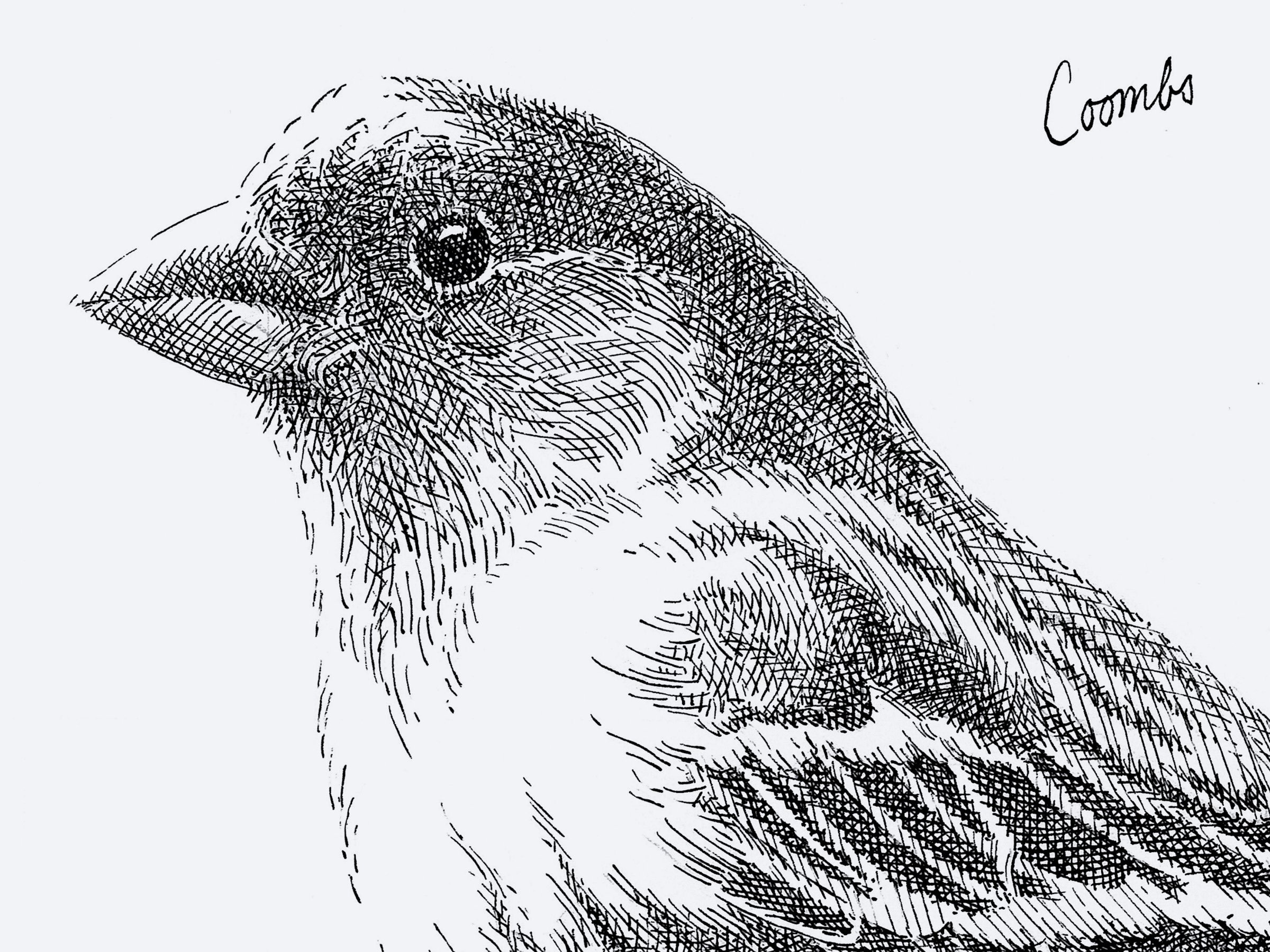
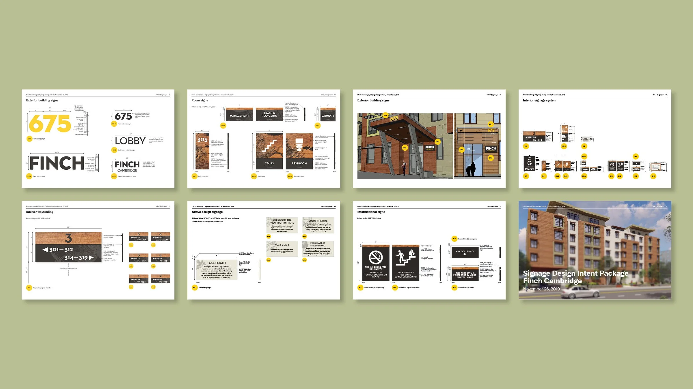
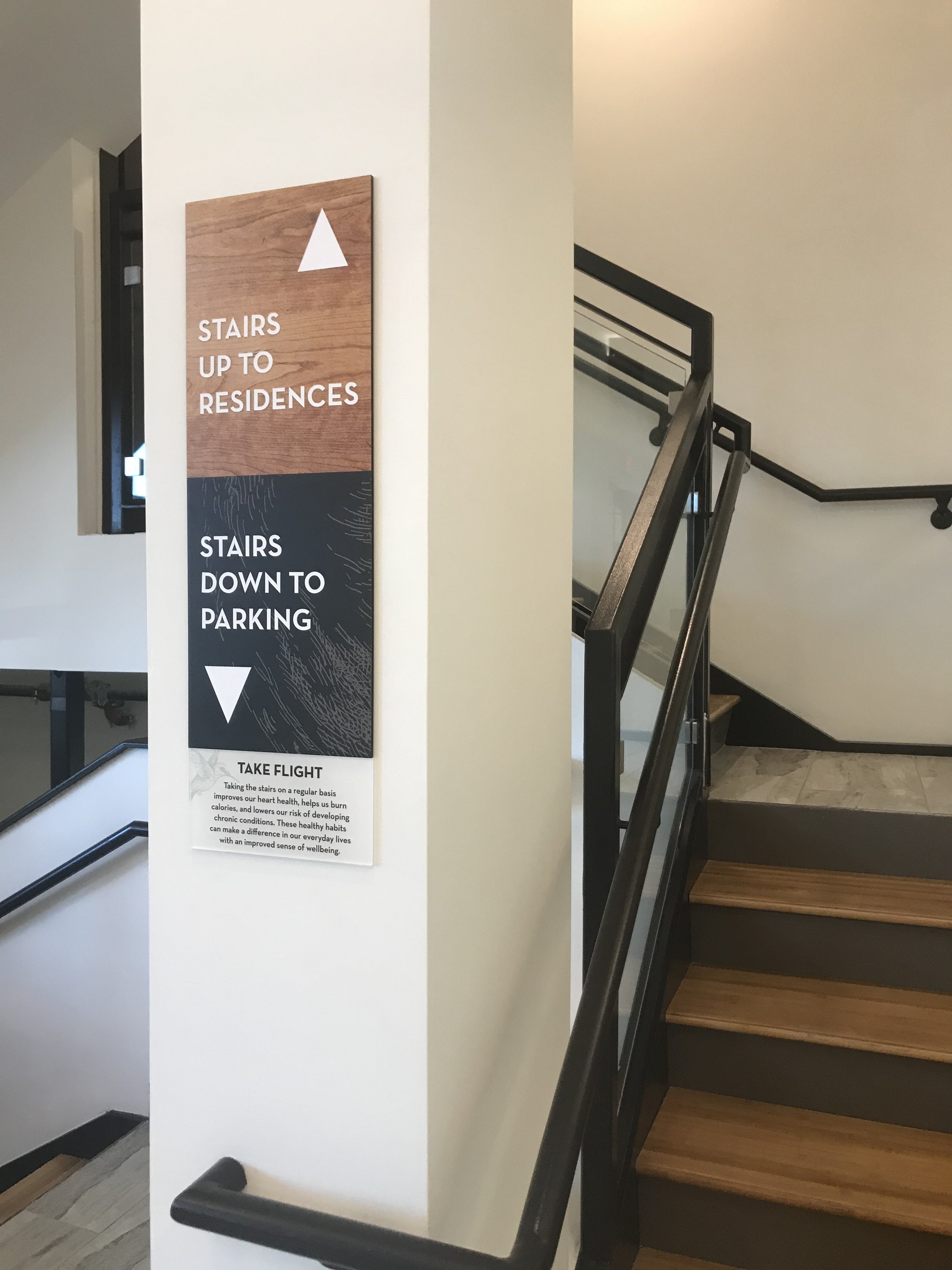
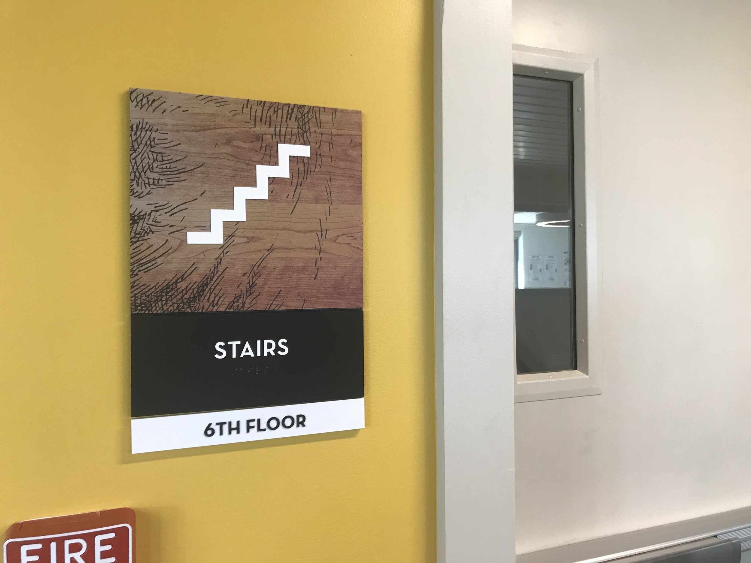
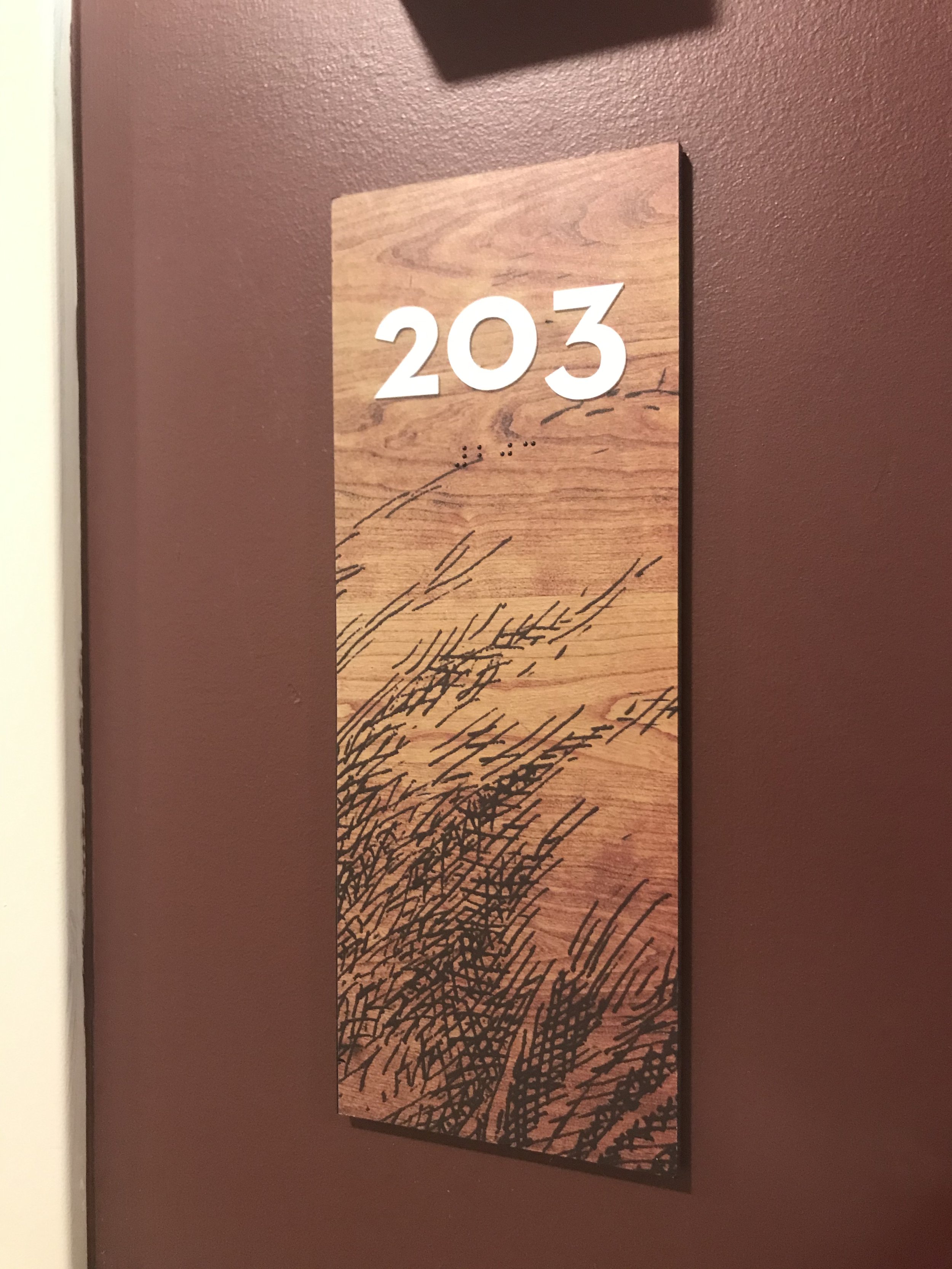
Naming and brand identity services extended into marketing collateral, copywriting, environmental graphic design, interior furnishings, and custom art commissioning. Connecting the residence to its unique place in the city, the finch became a symbol of the community, representing joy, diversity, and energy. Commissioned art by Barry Coombs enhances the visual identity and wayfinding inside the residences.
Completed while at Bergmeyer. Architecture by ICON Architecture.